Theme
Introduction
If you want to see how themes can look like check our free themes category.
As with every open source project everyone wan't to change something. We have option to style pretty much everything directly from back office. We can do following things
- Change widget style
- Change back office style
- Have personal themes
Theming window
Widget themes has few sections. I'll try in short term describe what you can do in each of them.
Multilanguage flow
Some of the widget theme attributes can be translated. Main translation will be shown if widget language matches default_site_access from settings file
If you are embedding widget in other language than default you have two options
- Either put text in correct language by clicking
Add translation - Either edit
default_site_accessand put same value as your widgetlangattribute without slashes - Either add your language to
['default_site_access_list'] => ['eng','lit']. E.g we will useMaintranslation if widget language islitoreng. Setting location
Replaceable variables in translatable text fields
You can use any variable from Online visitors list in any of translatable field.
Click info ico in line visitors list and navigate to Debug tab. There you will see json with all possible attributes
E.g
{args.ou.online_attr_array.first_name.value__is_empty__Visitor}Would use attribute from defined json. Also would useVisitoras fallback,
"online_attr_array": {
    "first_name": {
        "h": false,
        "secure": true,
        "identifier": "first_name",
        "key": "First Name",
        "value": "First name"
    }
}
{args.ou.id}id of online visitor
{args.ou.online_attr_system_array.playerClass__is_empty__Visitor}Would use attribute from
"online_attr_system_array": {
        "playerClass": "vip_3",
        "playerClass_secure": true
    }
Operator profile before chat start
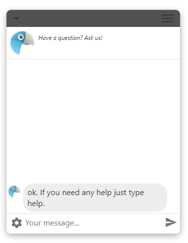
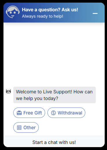
Operator intro text
This allows to change Have a question? Ask us! text
Status widget style
Here you can change main widget attributes. Like logo etc.
Some of these attributes are quite old and not used anymore. They will be removed in old version.
Widget container
Here you can change general outlook of widget. Like borders padding etc.
Widget header background color
Sets background color for widget header
Header icons order. _print is optional and indicates we should also print a text after an icon
Using this field you can adjust icons location in the widget
E.g let's put minimize and close icon to the right
* dropdown_print,dropdown_min,dropdown_popup,dropdown_fullheight,dropdown_close
* left_close,right_min,dropdown_popup,left_fullheight,dropdown_close
E.g dropdown_print,dropdown_min,dropdown_popup,dropdown_fullheight,dropdown_close

left_min,dropdown_print,dropdown_popup,dropdown_fullheight,dropdown_close

Widget border color
Border color for the widget
Widget border width (px)
Border width for the widget
Header height (px)
If you want higher header you can set it's height here.
Header padding (px)
Set custom padding for widget header
Widget width (px)
Override widget width directly from a theme
Widget height (px)
Override widget height directly from a theme
Minimize image | Only for a legacy widget
Image used to minimize the widget
Restore image | Only for a legacy widget
Close image | Only for a legacy widget
Popup image | Only for a legacy widget
Widget response layout width trigger (px) | Only for a legacy widget
Hide widget close button
You can hide close button in header by checking this.
Hide popup option
Hides popup option from header dropdown menu.
Try to detect language from browser headers
Widget will try to detect language by visitor browser and show language in his native langauge.
See youtube video how to setup it.
https://www.youtube.com/watch?v=iGGTKGrO9Ek&feature=youtu.be
Things to check if it does not work.
- Make sure you checked this checkbox
- Make sure your browser sends correct language headers while testing.
- Take a look at System configuration -> Speech -> Languages. Make sure Siteaccess column has a proper value.
Show go to survey button on chat close
Usually when chat is closed visitor is automatically redirected to survey. Instead of that you can show him Go to survey button just.
Before closing chat ask user does he really want to to close chat
Visitor will be asked for confirmation does he really want's to close a widget.
Close chat if page is refreshed. Usefull if you have embed code in popup.
If you have embeded Live Helper Chat script in popup it makes sense on popup close also close the chat.
Show start chat form instantly after operator closes a chat.
Instead of writing message chat was closed we will show start chat form for the visitor instantly.
Allow visitor to change font size.
You can allow visitor to change messages font size directly in widget.
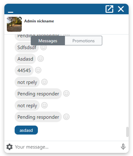
Show previous chat messages in chat widget.
In case you want to allow visitor to see previous chat message you can check this. Previous messages are shown only if we find previous chats by same online visitor.
Show operator profile in a new row
Usefull for UI combinations.
Close chat if page is refreshed. Usefull if you have embed code in popup.
Do not prefill offline message with chat messages.
In case you are prefilling user message, but do not want to prefill it in offline mode you can check this option.
Hide BB Code button
If you are using widget theme and want to hide Face icon (bb code) you have to check this option.
After how many user messages show switch to human button. empty - never, 0 - always
If you want to give easy way for a visitor to be transferred to operator you can enable this option.
This option is always shown and does not pay attention is there any operator at the moment in back office. So most logical way is just to use bot workflow itself as it can check is there any operators online.
Messages style
Here you can change how message style looks like for visitor.
Need help widget
You can change how need help widget looks like.
Chat widget
Here you can change default text in widget itself. Few more complex ones I have explained here.
Thank you for your feedback text
This text is visible after visitor fills in offline form. You can write bbcode there including custom html by warpping it with [html][/html] tag
Your request was logged [b]bold[/b] [html]<i>Italic</i>[/html]
Blocked visitor message
This field also support replaceable variables.
- E.g department e-mail
{args.chat.department.email} - Custom text from Translatable group items.
{blocked_email__Blocked email}
Text you can use in translation item or directly in widget theme.
Few more samples
You can't chat with us at the moment contact us by [url=mailto:{args.chat.department.email}]e-mail[/url]You can't chat with us at the moment contact us by {args.chat.department.email}{blocked_email__Blocked email}
How to show average wait time instead of a number in the queue?
- You have to be running department statistic cronbjob
Text when user starts a chat and is waiting for operator to join a chat. Only if queue is 1 or if less than a minute wait time.set value like Less than a minuteText when user starts a chat and is waiting for operator to join a chat. Only if queue is > 1. {number}, {avg_wait_time}, {avg_wait_time_live}, {avg_wait_time_live__string if more than one minute live wait time}, {avg_wait_time__string if more than one minute wait time}- Department average wait time - Your average waiting time for attention is {avg_wait_time} minute{avg_wait_time__s}
- Live wait time (
departament wait time-how long visitor is waiting) E.g Estimated wait time {avg_wait_time_live} minute{avg_wait_time_live__s} - If
departament wait time-how long visitor is waiting< 0 we assume less than a minute is left. First text is used in that case.
Average wait time will be calculated for all closed chat from last 3 days. You can change that in Live help configuration (tab) -> Chat (section) -> Statistic -> Configuration (tab). You can set shorter period of time. In that case you should set also this cronjob to run more frequently.
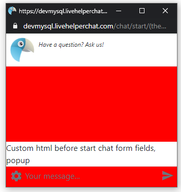
Custom content
You can write custom HTML in these fields to be appended in various chat widget places. You can also use start chat form settings to write HTML above all fields.
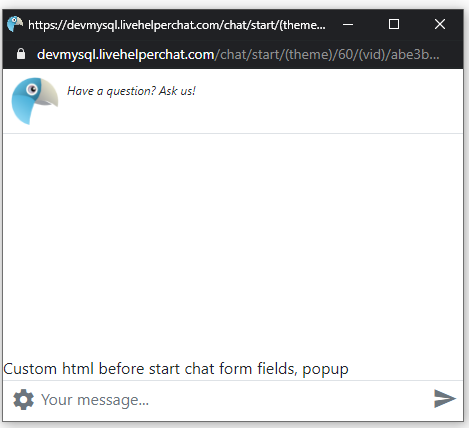
Custom html before start chat form fields, popup
React attribute path
{'k': ['chat_ui','custom_html_widget'], 'v' : 'Custom html before start chat form fields, popup'}
This HTML is shown if chat will be started with an operator and not a bot in popup window.
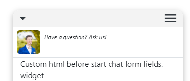
Custom html before start chat form fields, widget
React attribute path
{'k': ['chat_ui','custom_html_widget'], 'v' : 'Custom html before start chat form fields, popup'}
This HTML is shown if chat will be started with an operator and not a bot.
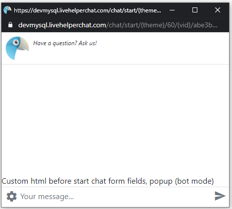
Custom html before start chat form fields, popup (bot mode)
React attribute path
{'k': ['chat_ui','custom_html_widget'], 'v' : 'Custom html before start chat form fields, popup (bot mode)'}
This HTML is shown only if chat will be started with a bot in a popup.
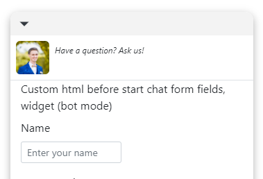
Custom html before start chat form fields, widget (bot mode)
React attribute path
{'k': ['chat_ui','custom_html_widget'], 'v' : 'Custom html before start chat form fields, widget (bot mode)'}
This HTML is shown only if chat will be started with a bot.
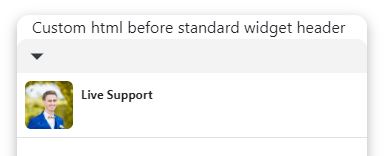
Custom html before standard widget header
React attribute path
{'k': ['chat_ui','custom_html_header'], 'v' : 'Custom html before start chat form fields, popup'}
HTML is rendered before widget header
Custom html after widget content
This field also supports JS execution on rendering.
<script data-bot-action="execute-js">
</script>

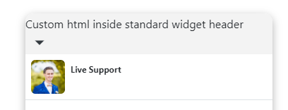
Custom html inside standard widget header
React attribute path
{'k': ['chat_ui','custom_html_header_body'], 'v' : 'inside header'}
HTML content is shown above standard widget header.
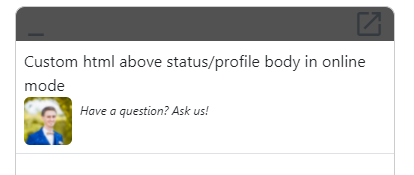
Custom html above status/profile body in online mode
React attribute path
{'k': ['chat_ui','pre_chat_html'], 'v' : '<b>Intro</b> pre chat HTML'}
This field location is identical to Start chat form settings. Pre-chat HTML field location.
Custom html above status/profile body in offline mode
React attribute path
{'k': ['chat_ui','pre_chat_html'], 'v' : '<b>Intro</b> pre chat HTML'}
This field location is identical to Start chat form settings. Offline Pre-chat HTML field location.

Intro messages
Operator intro message. You can wrap custom HTML with [html][/html] bbcode`
React attribute path
{'k': ['chat_ui','intro_message'], 'v' : '[html]<b>Intro</b> message with custom html[/html]'}
[html]<b>Intro</b> message with custom html[/html]
Operator intro message in HTML
React attribute path
{'k': ['chat_ui','intro_message_html'], 'v' : 'Custom html before start chat form fields, popup'}
<b>Intro</b> message with custom html
Results in

Custom html before standard widget status header
This field is not used in a new widget.
Custom html before standard widget status header
This field is not used in a new widget.
Custom html after chat status
<div id="after-chat-status" className="bg-transparent"><div class="my-1 bg-transparent" align="center"><div class="btn-group bg-light m-auto" role="group" aria-label="Basic example">
<button type="button" id="switch-messages-button" data-action='[{"action": "set_state","target":"messages_ui","value":true},{"action":"remove_css_class","target": "#switch-promotions-button", "value": "btn-secondary"},{"action":"remove_css_class","target": "#switch-messages-button", "value": "btn-outline-secondary"},{"action":"add_css_class","target": "#switch-promotions-button", "value": "btn-outline-secondary"},{"action":"add_css_class","target": "#switch-messages-button", "value": "btn-secondary"},{"action":"add_css_class","target": "#promotions-list", "value": "d-none"},{"action":"remove_css_class","target": "#messages-scroll", "value": "d-none"}]' class="btn btn-sm btn-secondary ps-4 pe-4">
Messages<newmessages> <svg style="width: 15px" viewBox="0 0 10 10" class="position-absolute" xmlns="http://www.w3.org/2000/svg"><circle cx="5" cy="5" r="4" stroke="white" stroke-width="1" fill="#0094ff"></circle></svg></newmessages>
</button>
<button type="button" id="switch-promotions-button" data-action='[{"action": "set_state","target":"messages_ui","value":false},{"action":"remove_css_class","target": "#switch-messages-button", "value": "btn-secondary"},{"action":"remove_css_class","target": "#switch-promotions-button", "value": "btn-outline-secondary"},{"action":"add_css_class","target": "#switch-messages-button", "value": "btn-outline-secondary"},{"action":"add_css_class","target": "#switch-promotions-button", "value": "btn-secondary"},{"action":"add_css_class","target": "#messages-scroll", "value": "d-none"},{"action":"remove_css_class","target": "#promotions-list", "value": "d-none"}]' class="ps-4 pe-4 btn btn-sm btn-outline-secondary">
Promotions
</button>
</div>
</div></div>
<div class="promotions d-none bottom-message p-2" id="promotions-list">
<div class="promotion-item">Promotion 1</div>
<div class="promotion-item">Promotion 2</div>
</div>
In combination with Widget body additional CSS, takes effect after save
#after-chat-status {
    width: 100%;
    position: absolute;
    z-index:999;
}
#promotions-list {
    top:40px;
}
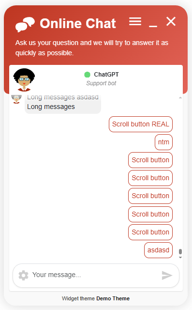
Results in switchable tabs in the chat. Messages tab also has indicator if there is new message while visitor is reading promotions.
Header HTML here you can paste custom header html you want that widget should have.
This file content will be appended to widget head content. You can use this field to add custom JS or any other HTML you want.
Custom CSS
If you want to style form directly using CSS you can use this section.
Status widget additional CSS, takes effect after save
This place styles iframe of status widget itself.
CSS
body {
    background-color: red!important;
}
You can also change default icon by SVG body
#lhc_status_container #status-icon:not(.offline-status):before, #lhc_status_container .lhc-icon-online:before {
    content: url("data:image/svg+xml,rest of your SVG");
}
Will result

See example how to change status widget dimensions using this field.
Widget container additional CSS, takes effect after save
This field has to contain direct CSS rules.
box-shadow: rgba(0, 0, 0, 0.3) 0px 4px 12px!important;border-radius: 12px!important;
Will result in a widget with a shadow. It set's style directly to an iframe itself.
Widget body additional CSS, takes effect after save
.message-send-area{
    background-color: red!important;
}
This field also supports fonts/styles preloads
If you put something like that font will be preloaded. Quotes " is required around font path
@font-face {
  font-family: 'Poppins';
  font-style: normal;
  font-weight: 700;
  font-display: swap;
  src: url("https://fonts.gstatic.com/s/poppins/v20/pxiByp8kv8JHgFVrLCz7Z1xlFQ.woff2") format('woff2');
  unicode-range: U+0000-00FF, U+0131, U+0152-0153, U+02BB-02BC, U+02C6, U+02DA, U+02DC, U+0304, U+0308, U+0329, U+2000-206F, U+2074, U+20AC, U+2122, U+2191, U+2193, U+2212, U+2215, U+FEFF, U+FFFD;
}
This way style itself would be preloaded
@import url("https://fonts.googleapis.com/css2?family=Poppins:wght@100;200;300;400;500;600;700;800&display=swap");
Will result in

If you want to style messages depending on their state here is logic to follow.
- Messages which will be stored has a class
.msg-to-store - Messages appearing as intro bot messages can be selected by
.start-chat > .index-row-0should be animated - Messages which are fetched first can be selected by
.online-chat > .index-row-0these should not be animated - Messages not having
.online-chat > .index-row-0should be animated. - Stylings buttons default button has those CSS classes
btn btn-sm btn-outline-primary btn-bot - While button click being processed it has
disabledattribute set.
How to change widget loader colors?
This is a loader circle which you see while the widget content loads for the first time.
#lhc-spinner-overlay .lhc-spinner-circle {
    border: 3px solid #f3f3f3!important;
    border-top: 3px solid #007bff!important;
}
CSS Rules to style form buttons and inputs and their shadows
E.g if you want high contrast ratio you can set --bs-btn-focus-shadow-rgb: 0,0,0 and change
--bs-btn-focus-box-shadow: 0 0 0 0.25rem rgba(var(--bs-btn-focus-shadow-rgb), .25);
to
--bs-btn-focus-box-shadow: 0 0 0 0.25rem rgba(var(--bs-btn-focus-shadow-rgb), .95);
/* To change buttons focus options */
/* You can apply similar rules to .btn-primary,.btn-info,.btn-success buttons also */
.btn-secondary {
    --bs-btn-color: #fff;
    --bs-btn-bg: #6c757d;
    --bs-btn-border-color: #6c757d;
    --bs-btn-hover-color: #fff;
    --bs-btn-hover-bg: #5c636a;
    --bs-btn-hover-border-color: #565e64;
    --bs-btn-focus-shadow-rgb: 130, 138, 145; /*change focus shadow color*/
    --bs-btn-active-color: #fff;
    --bs-btn-active-bg: #565e64;
    --bs-btn-active-border-color: #51585e;
    --bs-btn-active-shadow: inset 0 3px 5px rgba(0, 0, 0, 0.125);
    --bs-btn-disabled-color: #fff;
    --bs-btn-disabled-bg: #6c757d;
    --bs-btn-disabled-border-color: #6c757d;
    --bs-btn-focus-box-shadow: 0 0 0 0.25rem rgba(var(--bs-btn-focus-shadow-rgb), .25); /*Increase .25 to have higher contrast ratio*/
}

/* Options to change colors for form fields. */
.form-control:focus {
    color: var(--bs-body-color);
    background-color: var(--bs-form-control-bg);
    border-color: #86b7fe; /* Border color of input field */
    box-shadow: 0 0 0 .25rem rgba(13, 110, 253, .25) /*You can increase 0.25 to have higher contrast radio or just change a color*/
}

/* Make higher contrast ratio for settings icons */
#chat-dropdown-options {
    color: #000000!important;
}

/* Make send icon color red if it's missing text to sent */
#ChatSendButtonContainer .text-muted-light{
    color: red!important;
}
Custom CSS only for popup
#messagesBlock{
    background-color:red;
}
Will result
This will be applied only to a popup.
Custom page CSS (new widget only)
This will move widget. Same way you can change dimensions of a status widget.
#lhc_container_v2 #lhc_status_widget_v2{
        bottom:80px!important;   /* Adjust position from bottom */
        right:20px!important;    /* Adjust position from right */
}
Changed position from bottom. If you want to change size see this example

Custom bot style
You can change default bot buttons style.
Notification
If you are using notifications functionality you should set logo and notification details here.
FAQ
How do I make custom status icon?
In Custom CSS tab do the following changes.
In Status widget additional CSS, takes effect after save enter
#lhc_status_container #status-icon:not(.offline-status):before, #lhc_status_container .lhc-icon-online:before {
    content: url("data:image/svg+xml,%3Csvg%20class%3D%22w-20%20h-20%22%20xmlns......."); /*SVG content urlencoded*/
}
How do I make status icon smaller?
In Custom CSS tab do the following changes.
In Status widget additional CSS, takes effect after save enter
#lhc_status_container{
    bottom:3px!important;
    right:3px!important;
    padding-left:3px!important;
    padding-top:3px!important;
}

#lhc_status_container #status-icon{
    box-shadow:none!important;
    padding:5px!important;
}
In Custom page CSS (new widget only) enter
#lhc_container_v2 #lhc_status_widget_v2{
    min-height: 65px!important;
    min-width: 65px!important;
    max-height: 65px!important;
    max-width: 65px!important;
    width: 65px!important;
    height: 65px!important;
}
How do I place new widget at the bottom left corner using custom CSS section?
Create a new theme and make it default or just choose it while generating an embed code
In Custom CSS tab do the following changes.
In Widget container additional CSS, takes effect after save enter
left:30px;
In Widget body additional CSS, takes effect after save enter
.proactive-need-help{
  border-radius:10px!important;
  border-bottom-left-radius:0px!important;
}
In Custom page CSS (new widget only) enter
#lhc_container_v2 #lhc_status_widget_v2{
        left:20px!important;
}

#lhc_container_v2 #lhc_widget_v2{
    left:50px!important;;
}

#lhc_container_v2 #lhc_needhelp_widget_v2{
    left:45px!important;
}
That's it.
I have created a theme, how can I share it with community?
Community Themes will be published in github.
https://github.com/LiveHelperChat/themes
Few samples how widget look can be styled using widget themes in back office and start chat form settings. There was no file changes except back office settings.
How do I apply a theme?
You can either set default theme in back office or you can choose theme in embed code generation window.
How do I import a theme?
Navigation to
"System configuration" -> "Live help configuration" -> "Import new theme"
In this window just upload a new theme.
How do I apply imported theme, set the default one?
- You can set default theme in
Configuration -> Live Chat configuration -> Default theme
- Also you can apply themes individually to embed code by selecting combobox in widget generation window. So you can just choose which theme widget should use.
How do I pass theme to start chat window?
Theme argument is /(theme)/<theme_id> so you can just manually write what theme should use. E.g index.php/chat/start/(theme)/2
I have created a theme and want to share with community where should I send a theme file?
Just send it to me. remdex@gmail.com
How to avoid visitors finding out existing themes?
Just set an alias in widget theme. Theme won't be used if not valid theme alias is passed as argument.
Permissions for themes management
In order operator to be able edit themes, set default theme he has to have this permission
'lhtheme', 'administratethemes'
Manage abstract objects
'lhabstract','use'
Permissions for personal themes
Give permission to manage personal themes
'lhtheme','personaltheme'
Manage abstract objects
'lhabstract','use'